Graph
Find hidden connections in your traffic.
The Graph tool plots the relationships in your captured traffic as an interactive node graph — which apps reach which hosts, which hosts return which status codes, and so on. It’s a fast way to get a visual overview of connections that are hard to see in a flat message list.
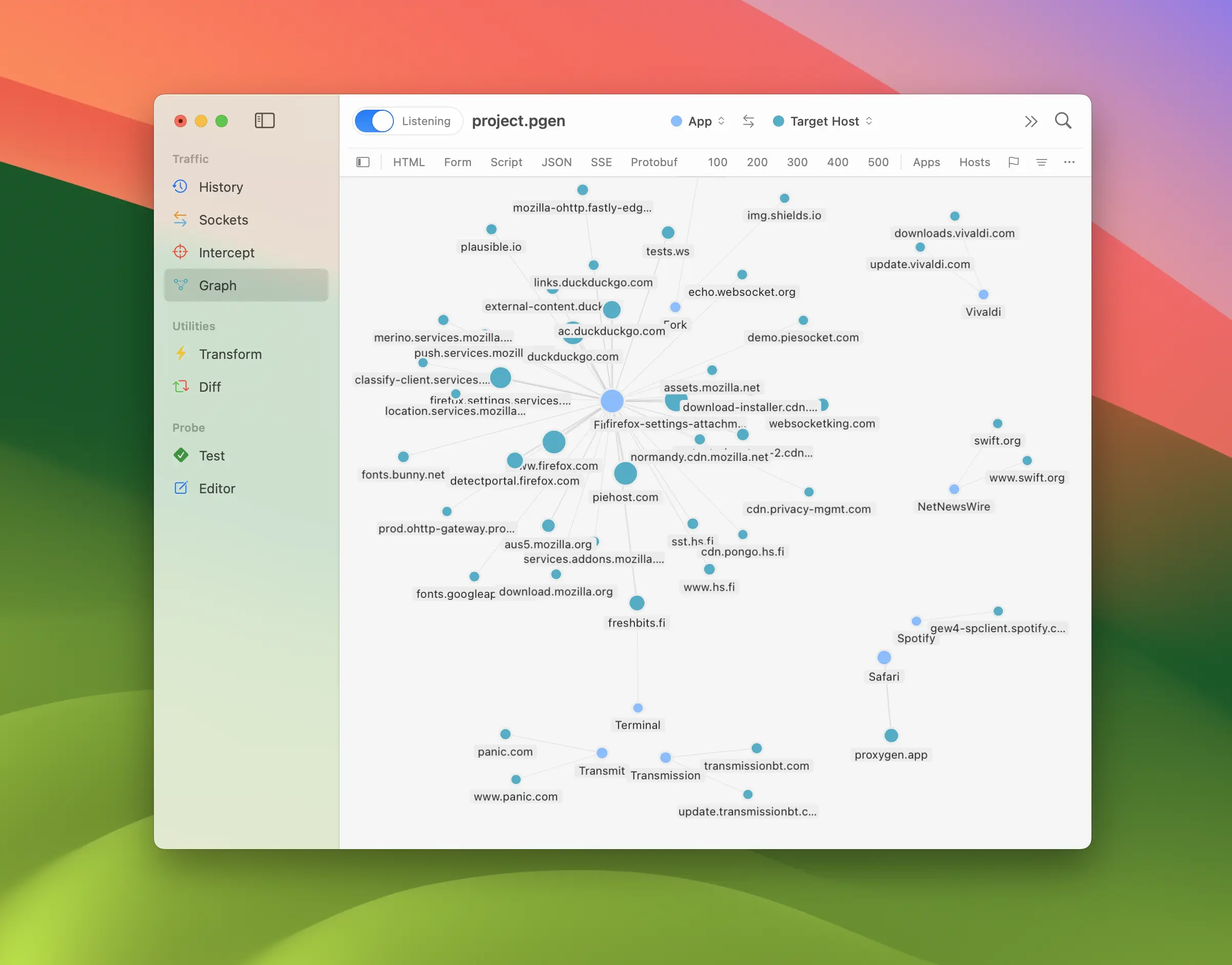
Each circle is a node — a distinct value of some traffic attribute, such as one app or one host. A line between two nodes is an edge, meaning traffic flowed from one to the other. The more transactions a node or edge represents, the larger the circle or the thicker the line, so heavily used connections stand out at a glance.
The graph is built from the same traffic as History, narrowed by the Graph tool’s own filter. It updates as new traffic arrives while the tool is open.
Choosing nodes
The Nodes control in the toolbar sets which attributes the graph plots. The left pull-down picks the source attribute and the right one picks the destination attribute. The button between them swaps the two.
By default the graph plots App → Target Host, but you can pair up any of the following attributes:
- App — the client application that sent the request
- Request Method — the HTTP method, such as
GETorPOST - Target Host — the destination host
- URL Path — the request path, with the query stripped so different queries collapse to one node
- Request MIME — the content family of the request body
- Response Status — the HTTP status code
- Response MIME — the content family of the response body
- Remote IP / Remote Port — the address and port of the server
- Local IP / Local Port — the local address and port of the connection
- Flag — the flag assigned to the message
Transactions that carry no value for the chosen attribute (for example a request with no recorded client app, or one with no response yet) are left out of the graph.
Navigating the canvas
Drag the empty canvas to pan and use the Zoom controls in the toolbar to zoom in, zoom out, or zoom to fit the whole graph. The graph re-frames itself automatically when the node set changes, so you always start with everything in view.
Hover over a node to highlight it together with its directly connected neighbours and the edges between them, making it easy to follow what a node links to. Click a node to select it; shift-click to select several. You can also select an edge to act on both of its endpoints at once.
Arrangement and grouping
The Arrange control switches between three layouts:
- Clusters — a free force-directed layout where connected nodes pull together and unrelated ones drift apart.
- Radial — nodes settle onto arcs at fixed positions.
- Grid — nodes settle into an even grid.
The Grouping control toggles between Ungrouped and Grouped. When grouped, similar nodes are bucketed together automatically — hosts by their registrable domain, paths by their first component, and so on — so related nodes gather into separated blocks instead of spreading evenly.
Distribution list
Toggle the distribution panel from the accessory bar to show a list of every node currently on the canvas. Source nodes are listed first, then destination nodes, each group ordered by transaction count with a bar showing the relative HTTP message volume.
Selecting rows narrows the canvas to just those nodes plus their neighbours — the same way selecting rows in History’s Sitemap filters the message list. Use the Filter field at the top of the panel to find nodes by name. Hiding the panel releases the narrowing and shows the full graph again.
Searching
Use the Search field in the toolbar to find nodes by label. The graph narrows to the matching nodes plus their directly connected neighbours, so a matched node still shows what it links to.
Filtering traffic
The Graph tool uses the same filter accessory bar and filter rules as History, kept separate from History’s own filter. Toggle the content family and status toggles, drill down with the Hosts and Clients popups, or enable filter rules with control-f for finer control. Saved filter configurations work here too — use the menu at the end of the accessory bar to Save Filter, Manage Filters, and recall them.
Right-click a selection on the canvas for quick actions:
- Show in History opens the History tool filtered to the selected nodes, or to everything shown when nothing is selected.
- Filter Host / Filter App narrows the graph to the selected host or app nodes.
- Add Filter Rule turns the selection into a filter rule when the selected nodes share a single attribute.
These actions make it easy to spot an interesting connection in the graph and jump straight to the underlying messages behind it.